As everything I’m writing here, this would be also simple.
First and foremost, there are many useful tips, articles, even videos on the net related to the color , just Google it and you’ll find enormous amount of knowledge there. Maybe it will be overwhelming for someone who’is just starting to see colors in photography but nevertheless color is a must know if you want to improve yourself.
Information you find about color, even if you just started seeing it in photography, will be extremely helpful also in others area of your life. You’ll learn how colors affect our feelings, what can be expressed just by color, what colors should you not put in your bedroom, what kind of person is standing in front of you just by colors they wear…Yeah, seriously. Color can say much. Have you ever wondered why almost every theater is red?
Sometimes color interfere with shapes overpowering them but sometimes color works with elements presented. Learning the difference between those two is a knowledge. At first, it’s not that easy to see color as an element but after you train your brain to see different elements in an image, shapes, lines f.e., very soon you’ll be stating to notice color as a separate element.
Documentary photography, street photography, photo journalism are great examples of smart use of color or should I say lack of color.
If there is so much going on already in the photo you have not much control of, then why making situation more chaotic then it already is by keeping the colors in? Isn’t it easier for you as a viewer to see right away what does the street photographer meant to capture, without colors present in the image? Of course there are other elements photographer used to make sure he/she will be understood easier, but can you determine now how color is an element and thoughtfully used by a photographer? If an image is in black&white tones then there is a reason for that, and same, if an image is in color, there is a proper reason why a photographer chose that image be in color.
I was told that I need to put a example of street photography with or without color to illustrate my point, but the truth is that I don’t have a valid street example for showing you. If I shot something someday, I’ll post. For now, you’re limited to Internet.
It’s not a street but it’s a documentary photograph which can serve as an example where the color works.


I was limited by conditions and spot I was given to sit. You can also see limitations of equipment I had when I took this photo. The settings were 1/125 sec; f/3,9; ISO 800 and my camera couldn’t deal with it.
With that equipment I always must make compromises and sacrifice something (or everything, that seems to me is the truth lately) In order to get a decent exposed (but still not properly exposed) photo, I must raise my iso (max of the camera is 1600), use the lowest possible shutter speed, and the widest aperture.
The lens is decently sharp across entire range, but of course when wide open and with that camera and with that small amount of available light is just as you saw in the examples above.
So don’t mind the pixel quality but do pay attention what color gave me here. It gave me possibility to say more then I would say without color.
Can you tell that he is a poor, hard working man? That he is hiding his eyes from me and my camera, feeling some sort of shame because of his clothes, his hands and the state of his house? Can you guess who give him that frayed NY sport cap? Can you conclude that his smile is in contradiction to all of stated?
Do you see how dirty is his collar and the cap? You can’t see that in color version.
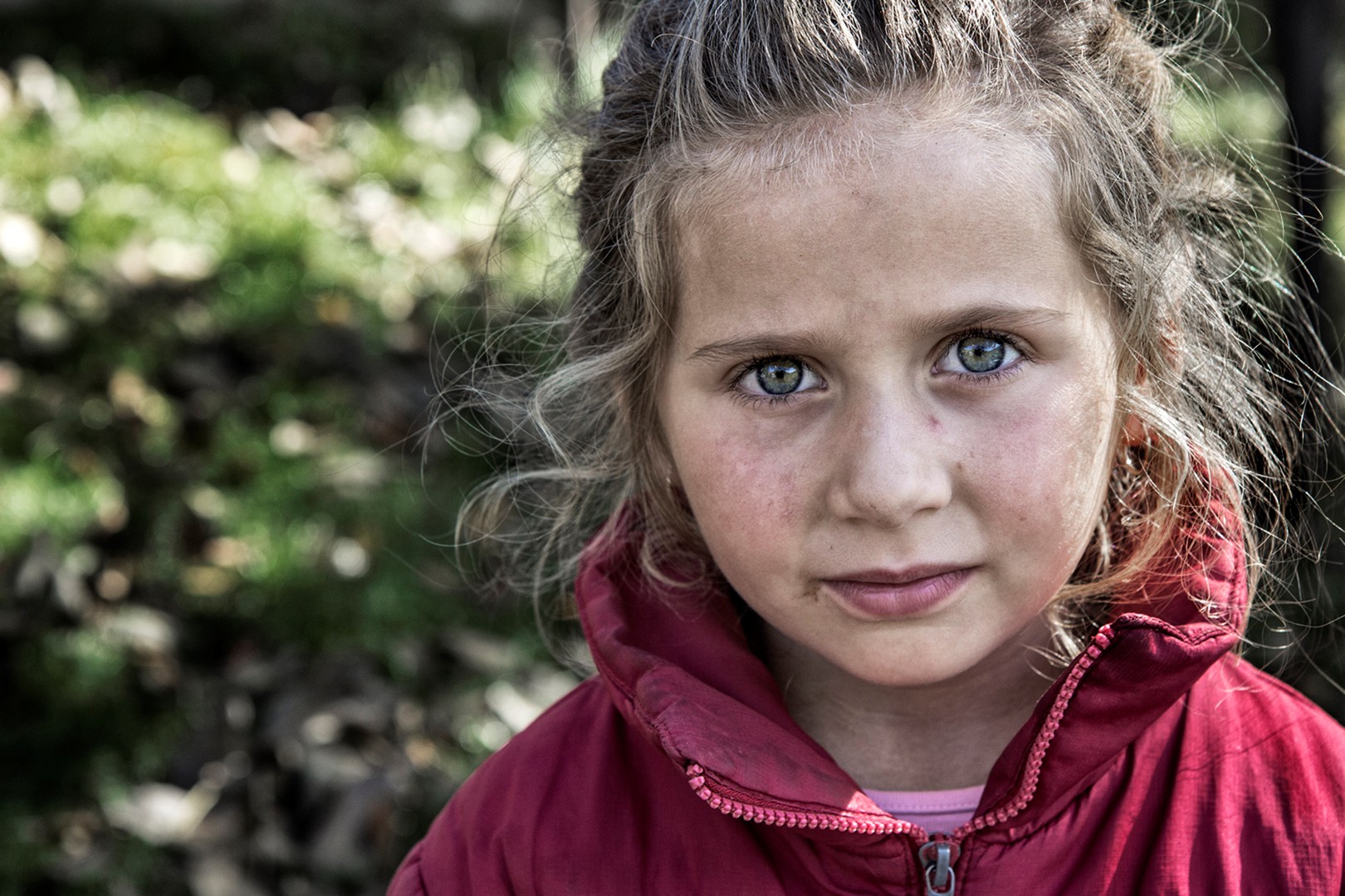
Photo of that beautiful girl that I posted first works both way, in color or black and white, but it’s more intense with color present. Look at the color of her eyes f.e., it contradicts to dirt on her face and jacket and that contradiction make both of attributes more pronounced.
I just can’t skip mentioning the real impact of photography. The first photo is much easier to get noticed. The girl is beautiful and is captured with somewhat better camera. Most people will be drawn to this photo. The second one is not that attractive at all. The quality of the image is questionable, the subject is not that pretty, should I say, and that all combined wouldn’t attract many viewer. Only those who care just about impact will stop for a few seconds to really see what is going on there.
Back to the color.
Maybe I should mention that cameras produce some colors much more vividly then they really are in real life, so I tend to desaturate red, pink,magenta, tones in post processing. I hate facing those colors in post processing.
No matter what kind of photography interest you I wrote here few simple pointers about use of color which, I think, everybody understands.
- Red, green and blue are most dangerous colors. They demand attention, your eyes will notice those colors first. If you have those colors in background they would be very distracting and draw attention away from your subject. Look for a background that does not contain those colors. If impossible, then tone them down, desaturate, change hue… do something in pp.
It is very hard to cope with grass in a photo f.e Have you noticed that green of the grass in a photo (in a pro photo if I may say like that) is never the actual green of grass?
– If you want to accent something then go for red, green and blue.
– Most pleasing background would contain colors within same color family.
– If you have to have blown background, make sure that it’s blown evenly.
– You have to ask yourself what do you want to accentuate? What feeling you want to create? and use colors accordingly
– Why is a devil red? an angle white? What colors are traffic signs/lights?
– When photographing someone think about what colors should they wear? What people want to say about themselves?
– What colors do you have in your home? bedroom is place to relax and have sweet dreams. Would you paint it with red?
If I have no control with conditions when I shoot I’ll certainly correct color in pp. Tools I use the most in ps are curves and hue/saturation adjustment layer.
Maybe to mention also that different adjustments which are not necessarily about the color, will as a result produce different saturation of colors. Curves f. e. when you make your adjustments in curves, let’s say you want to boost the contrast , boosting your contrast will also saturate the colors in the photo. If you don’t want to alter saturation you can chose Luminosity blend mode for the curves layer.


2 Responses to “Think, Color 1”
That photograph from the girl is worthy the cover of a National Geographic Magazine, the eyes protrude and you just can’t turn away from them. Every one of your pictures seem to tell us a story…lovely browsing them. Don’t stop…
I hope you realize how you’ve just made my life so much easier Pav
Thanks a lot!
And I would really like if you worked for National Geographic Magazine.
Maybe I should write a “Dealing with compliments” post. It would be funny. I know I’m smiling the whole day